


Tracking deal flow and reporting on portfolio companies can be manual, time-consuming, and inefficient—which is why we created Affinity Analytics.
Affinity Analytics is a powerful, automated reporting tool that provides deeper insights into your Affinity data. Its standardized templates and intuitive interface help private capital firms monitor their deal flow, business relationships, and portfolio companies more efficiently.
This guide walks through the basic features of Affinity Analytics and how to use them in your firm’s workflows. You’ll learn how to:
- See where your best deals come from: Interactive reports on your deal pipeline highlight the sectors and channels driving your deal flow—and any process blockers—at a glance.
- Understand how teams engage with deals: A detailed view of your team’s deal interactions provides key insights for optimizing outreach strategies and nurturing important relationships.
- Save hours on reporting: Analytics dashboards can be generated and shared in minutes, saving platform and data teams hours in developing bespoke reports.
For a closer look at customizing dashboards and more advanced best practices for using Affinity Analytics, check out part two of this guide, Affinity Analytics for private capital: Going deeper.
Who can use Affinity Analytics? All Scale, Advanced, and Enterprise users.
How does it work? Affinity Analytics is powered by Looker, Google Cloud’s world-class business intelligence and analytics platform. Using their leading reporting capabilities, we created an analytics solution customized to private capital firms’ needs.
Key features of Affinity Analytics: Dashboard templates
Affinity offers four pre-set dashboard templates based on our customers’ top use cases:
- Funnel Analysis
- List Summary
- Team Activity
- Introductions Summary
These templates help you get started quickly and easily access your most frequently reviewed data points. You can also customize the data fields in each template depending on your team’s requirements.
How do you access Affinity Analytics?
1. Select an Affinity list you want to monitor and click on the plus sign at the top right of the list.
2. Choose one of our pre-set reporting templates (Funnel Analysis, List Summary, Team Activity, or Introductions Summary), or select ‘New Board’ to create one from scratch.
3. Once you’re within a template, you can edit its data fields by clicking the ellipsis (3-dotted icon) in the top-right corner of each module.

1. Funnel Analysis
Funnel Analysis provides a birds-eye view of how deals move through your team’s pipeline, from sourcing to close. It tracks important metrics related to the status and status changes of items in a list.
When looking at a deal list, Funnel Analysis can tell you how many deals your team is working on at the due diligence stage or how long it takes to win a deal after the first meeting.
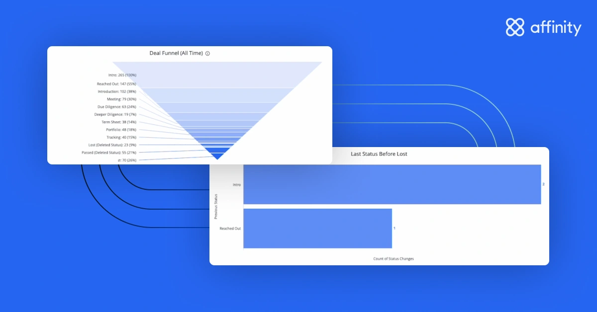
Track deal pipeline and progress
With a complete history of status changes, Funnel Analysis enables deeper insights into your team’s deal pipeline—including when (and how many) deals move from new to won, lost, on hold, or passed on.
By assessing the last status of a deal before it was lost, you can see which stage your team tends to lose deals at. For example, maybe the majority of your team’s deals are lost at the introduction stage or after the second meeting.
These insights can help your team identify patterns in deal progression, understand why deals were lost or not pursued, assess the quality of their deal pipeline, and make adjustments to their sourcing strategy.
Pro tip: You can visualize data in this template in column, bar, or funnel format depending on preferences.
Assess the time spent in each deal stage
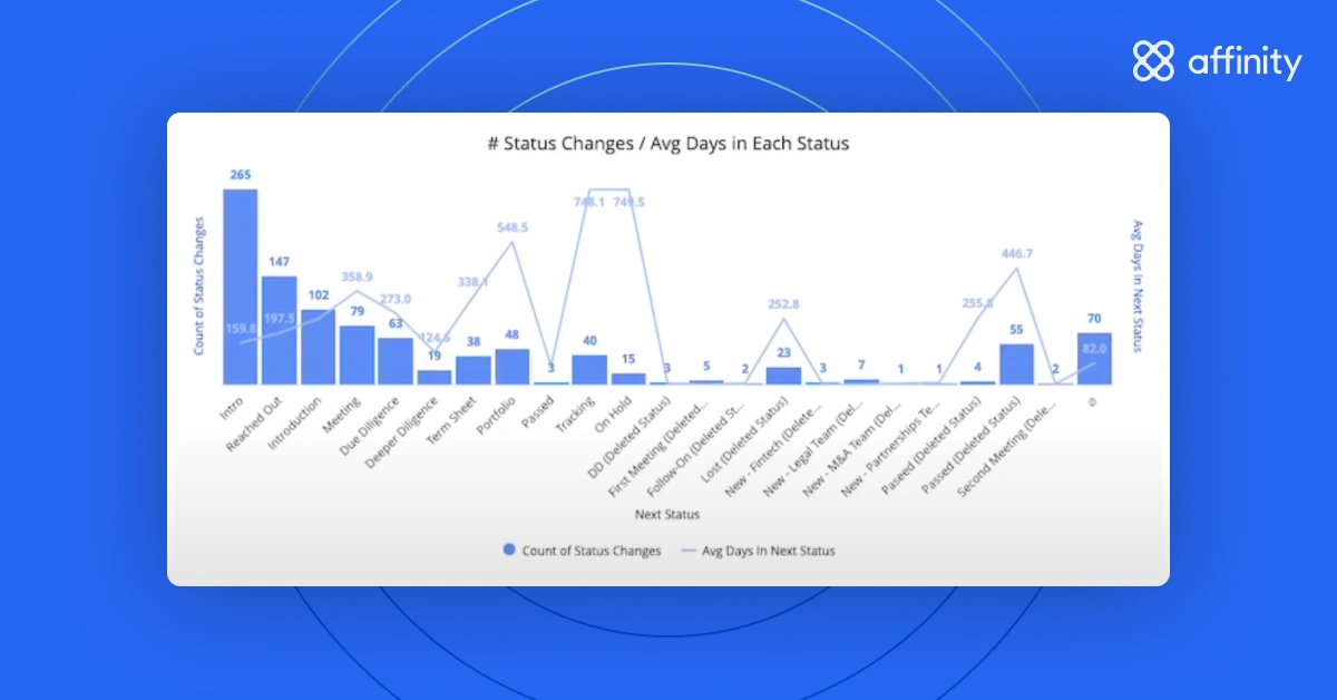
The Funnel Analysis template doesn’t just show the number of deals moving through your team’s pipeline, but it also includes the average (or median) number of days spent in each status. This helps you answer questions like, ‘How long does it take to move a deal from awareness to the first meeting? Or from the first meeting to close?’
While your team’s dealmaking speed impacts the health of their pipeline, it also affects a founder’s experience; a drawn-out process could diminish a founder’s appetite to work with your firm. Analyzing how much time deals spend in each stage pinpoints where your team can improve their efficiency.
Pro tip: You can monitor status changes by month for a more granular view of your firm’s deal efficiency over time.
What data can you access in Affinity Analytics? All of the data in a list view can be accessed in Affinity Analytics, with a few exceptions: data stored in Notes, reminders, and Crunchbase data.
How often is data refreshed? Underlying data refreshes once every 1–2.5 hours.
2. List Summary
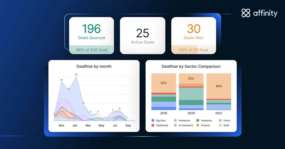
The List Summary template provides a high-level overview of the data in your Affinity lists. It segments and aggregates this data into different categories (like industry, amount, and location) to help you better understand your team’s deals.
Use this template to analyze opportunities by deal team, deal size, and location over time—helping determine whether your team needs to reallocate workloads or focus on more deals from particular industries.
Analyze trends by deal team, amount, location, and industry
Sorting deals into categories makes it easier to see what’s working, what isn’t, and where to focus so you and your team can make better data-driven decisions.
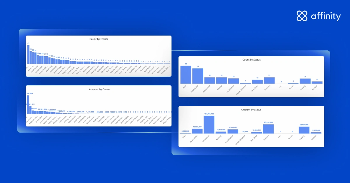
Key metrics tracked in List Summary include:
- Organizations: Monitor the number of organizations added to a given list by month, year, and deal owner to pinpoint your team’s most active sourcing periods and channels.
- Amount: View amounts (e.g., deal sizes) by deal owner and status, and quickly identify your top 10 highest-value deals.
- Location: Analyze deals by country and state for clearer geographic insights.
- Industry: Track the top 25 industries in your pipeline with customizable options to sort data by sector or other factors you include in your list.
Pro tip: You can add any attribute you track in an Affinity list (e.g., investor type) to the List Summary template.
Aggregate data for a quick snapshot
List Summary aggregates five important metrics at the top of the dashboard: deal count, deals added, average amount (a numerical value defined by the user in the 'amount' field of the list), and number of first meetings set and emails sent over the last 30 days.

With this feature, you can:
- Monitor pipeline volume: View the total number of organizations in your pipeline and how many were added over the last 30 days.
- Assess deal amounts: Pull averages, sums, or ranges (minimum and maximum values) for any numerical columns in your list, like deal sizes or funding amounts.
- Track initial engagement: Determine the success of your team’s first engagement with an organization by assessing the number of first meetings held and emails sent over the past 30 days.
Pro tip: You can increase the time period these metrics cover to any period longer than 30 days.
3. Team Activity
The Team Activity template helps you better understand trends in communication and engagement by providing a detailed view of your team’s interactions with their business network.
Using the email and calendar data stored in Affinity, Team Activity tracks important metrics, including: who your team is meeting and emailing, the companies they’re engaging with, and the depth of those interactions. This visibility helps determine where to focus efforts to optimize engagement and nurture valuable relationships.
Surface key trends in engagement
Team Activity shows the total number of external organizations and people your team emailed and met with over the last 30 days—sorted by country, industry, status, and more.
Aggregating and categorizing this information provides actionable insights into your team’s communication patterns, helping ensure outreach efforts are strategic and effective.
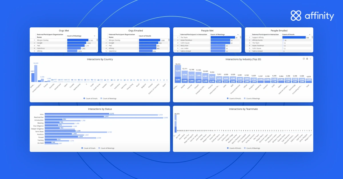
What you can track:
- Engagement volume: See all of the organizations your team is engaging with, including the number of emails and meetings tied to each.
- Interactions by categories: View communication data by pipeline status, investment stage, industry, country, or team member to determine areas where your team can improve their time spent.
Pro tip: Use Team Activity to identify your team’s most effective outreach strategies. For example, if an investor sends 10% fewer emails than their peers but still schedules the same amount of calls, they’re likely doing something right—and others can replicate their practices.
Monitor changes in communications over time
The module at the bottom of the Team Activity template shows the same interactions data as the rest of the dashboard—total meeting and email count—but in a bar chart, making it easy to spot trends over time.
All of the data in this dashboard is set to year-to-date by default. If you want to customize the time period, select the ‘Interaction Date’ filter at the top of the dashboard.
Pro tip: The Team Activity template includes future meetings, so you can account for meetings scheduled up to one month in advance.
4. Introductions Summary
The Introductions Summary template provides a way to quantify the value of your firm’s network. It automatically tracks the number of introductions Affinity users make to external contacts from activity and communication history.
By sharing an Introductions Summary report with your founders, you’re giving them an accurate, up-to-date record of all of the people and organizations that have contributed to their success. Similarly, sharing this information with prospective LPs demonstrates the value of your firm’s connections.
Track introductions made for your portfolio companies
Introductions Summary provides a clear picture of the number of introductions made on behalf of organizations, the number of organizations introduced, and the individuals involved—so your team can monitor how their connections are supporting portfolio growth.
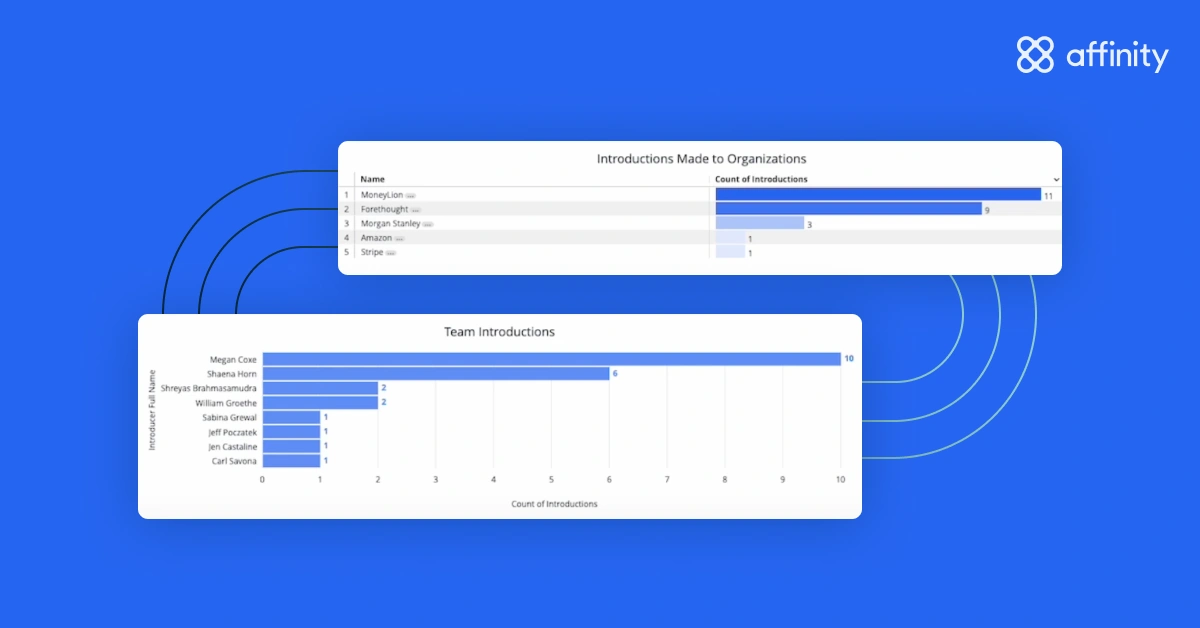
This template also helps you track trends in introductions over time, including the count of introductions made each month and the roles or titles of the individuals being connected. You can use it to ensure you’re not overusing the same experts.
Pro tip: Use Introductions Summary to see where your connections can have the most impact across your portfolio companies.
Analyze introductions by firm, team, or certain team members
Introductions Summary also looks at key details like the introducer, individuals involved, and dates of introduction. This information helps assess team performance and convey the impact of each introduction.
You can categorize the data in Introductions Summary to see:
- The number of introductions made by month: See how the number of introductions changes over time, helping you assess trends and periods of high activity.
- Organizations introduced by month: Review the organizations that were introduced to your portfolio companies and when to evaluate how effective your efforts were.
- Specific people and job titles introduced: Understand who within each organization was targeted to ensure your team is reaching the right people.
Pro tip: Filter the data in the Introductions Summary template by date, team member, role, and job title to see the types of connections that led to the most successful deals or partnerships—so you can scale up your most effective introduction strategies.
Exporting and sharing templates
Once your dashboard templates are ready, Affinity Analytics makes it easy to share them with your team or external partners. This ensures everyone’s on the same page and hours aren’t lost on reporting. You can also schedule a template to be sent directly to your audience’s inboxes at a specified date and time.
Who can share templates with others? Only Creators (Admins) can send reports to other people. Viewers (Standard users) can only send reports to themselves.
To export a template:

- Go into your dashboard template (e.g., List Summary), click on the three dots at the top right corner, and select ‘Download.’
- Select your desired format (PDF or CSV) and page size for the download (e.g., fit page to dashboard, letter, A1).
- Click ‘Expand tables to show all rows’ to ensure all of your data is visible.
- Click the ‘Download’ button in the bottom right corner, and the export will begin.
To schedule a template for later delivery:

- Go into your dashboard template (e.g., List Summary), click on the three dots at the top right corner, and select ‘Schedule delivery.’
- Name your delivery under ‘Schedule Name’ (e.g., ‘Deal List Summary’) and select its frequency under ‘Recurrence.’ For example, you can schedule a delivery for the first of every month at 8:00 AM or Mondays at 12:30 PM.
- To specify who receives the template, select ‘Email’ under ‘Destination.’ Then, enter your recipients’ email addresses and the format (PDF, CSV, or PNG).
- If you have any filters applied to your template, you can manage them in the ‘Filters’ section.
- Under ‘Advanced options,’ you can customize a message to be sent with the template, select the paper size, and select your delivery timezone (set to America - Los Angeles by default).
- When you’re ready to schedule your delivery, click the ‘Save’ button in the bottom right corner. You also have the option to send a test.
Pro tip: Auto-schedule Funnel Analysis reports to your full team before Monday morning meetings or on a quarterly cadence to prepare for LP reporting.
Transform your data into actionable insights with Affinity Analytics
Affinity Analytics is more than just a reporting tool—it’s a game-changer for private capital firms. By centralizing your data and reporting analytics, Affinity Analytics empowers your team to make faster, data-driven decisions.
Top private capital firms use Affinity Analytics to optimize their team’s resources, maximize the impact of their business networks, and pursue more valuable deals. In the process, they’re able to invest their time where it matters most: optimizing their deal pipeline, uncovering key business trends, and mapping out their strategies for future growth.
To learn how to customize Affinity Analytics to best support your team’s requirements, reach out to your customer success manager or customersuccess@affinity.co.
For a closer look at customizing dashboards and more advanced best practices for using Affinity Analytics, check out part two of this guide, Affinity Analytics for private capital: Going deeper.
{{request-demo="/rt-components"}}


